I Automated My Paper Reading Backlog (And Learned What Actually Breaks)
I have a reading plan, and I keep to it. The problem is every paper outside it — the ones I saved because they looked relevant and then never opened again. This is a record of what I built to deal with that, and the six places where it broke.
I Automated My Paper Reading Backlog (And Learned What Actually Breaks)
A side note from a dentist who had never opened a terminal before.
The problem
I collect far more papers than I read.
I should be clear that this is not the same as falling behind on a reading plan. I have a reading plan, and it runs on its own track. The problem is everything outside it — the paper I glanced at in a feed and saved because it looked relevant, the reference I chased down while writing something else, the copy I filed away because I might need it in three years.
These papers enter Zotero and stop. Nothing pulls them forward, because they were never part of any plan. Over time the library becomes a place where things go to be forgotten.
What I wanted was not a way to read all of them. I wanted a way to know, in about ten seconds, whether a paper deserves my actual attention. That seemed like something a machine could help with.
What I built
I add a paper to Zotero. That is the only thing I do. By the next morning, a structured summary and a one-page infographic are waiting in my Obsidian vault.
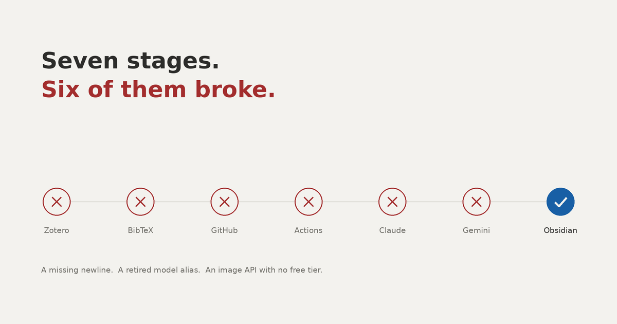
In between, Better BibTeX exports my library whenever it changes. A scheduled job on my Mac pushes that file to a private repository every fifteen minutes. Once a day, GitHub Actions compares the last 24 hours of commits and pulls out anything new that has an abstract. Claude Code writes the summary, Gemini generates the infographic, and both get committed back. The same scheduled job then copies them into a folder inside my vault.
None of this is original. It is plumbing — connecting tools that already exist. The design was not the difficult part. What took the time was the six places where it refused to work.
What comes out
The summary follows a fixed structure: overview, difference from prior work, methods, results, discussion and limitations, keywords. The keywords come through as tags, so the paper connects itself to my other notes without my doing anything.
The infographic is a single page — the conclusion in a header, then three columns for setting, key results, and discussion.
The first paper I ran through it was Suárez-López del Amo and Monje's AAP Best Evidence Systematic Review on biologics for ridge preservation. The summary caught the distinction that matters most: clinical and radiographic outcomes were comparable to conventional protocols, while histomorphometric outcomes favored biologics. That is the difference I would want to notice before deciding whether to change anything I do.
Where it broke
This is the part I would have wanted to read before I started.
Markdown inside the YAML file broke the file. The workflow contains a long prompt written in plain language, and my prompt included code blocks. YAML uses indentation to determine structure, and those code block markers interfered with it. I rewrote the prompt as flat prose. Two failed runs.
A missing newline stopped everything, silently. The last line of the workflow file had no trailing newline, so GitHub Actions could not read it. What made this difficult is that it did not report an error. The run simply never appeared. I spent a long time refreshing a page, waiting for something that was never going to start.
Pasting over an existing line left a duplicate character. I replaced a section by pasting on top of it and ended up with - - name: instead of - name:. One extra hyphen, one more failed run.
The model shorthand pointed at a retired version. The workflow specified a convenient alias rather than a full model name, and that alias resolved to something that no longer exists. Naming the version explicitly fixed it. If you are following a guide written a few months ago, I think it is safer to assume every model name in it is out of date.
The GitHub App was a required step the guide never mentioned. Claude Code Action needs an OAuth token, which I had, and it also needs the Claude GitHub App installed on the repository, which I did not know. The error message was clear enough once I reached it, but there was no way to anticipate it beforehand.
Gemini's image model has no free tier at all. This one confused me the longest. The API returned a quota error, and I read it as meaning I had used up my allowance. Reading more carefully, the message said limit: 0 — not depleted, but zero from the beginning. The model is paid only. Adding billing to the project resolved it immediately.
There was a seventh problem that was entirely mine. The files were arriving correctly, but I could not see them, because I had set the destination to one Obsidian vault while working in a different one. It seems worth checking which vault you actually have open before debugging anything else.
What I would change
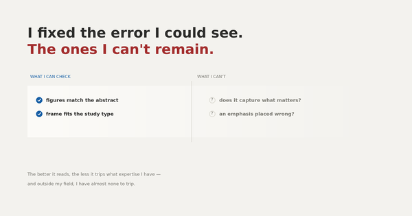
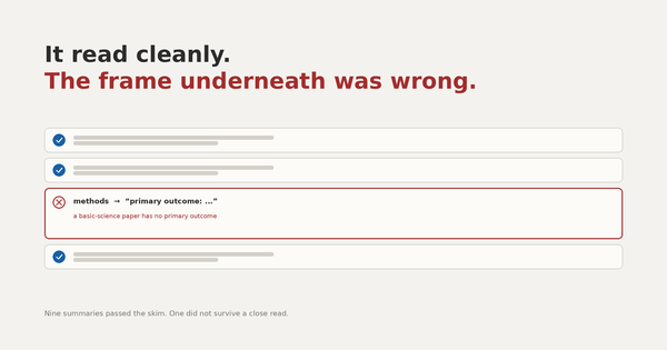
The infographic prompt assumes the wrong kind of paper. The template I borrowed was designed by a gastroenterologist for clinical trials. Its left column asks for study design, population, exclusion criteria, primary outcome, statistical methods. That is right for an RCT. For a systematic review or a consensus report it leaves most of the column empty, and a large share of my library is exactly that. I plan to rewrite it so that it does not assume a study type.
The prompt also asks the image model to draw charts. A generative model producing a chart of clinical results is producing a chart it invented. The numbers will look reasonable and mean nothing. I would replace that instruction with something that presents the findings as text.
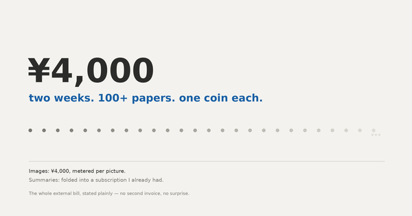
I need to watch the cost. Image generation is billed per request, and my library grows unevenly — some weeks nothing, some weeks a dozen papers. I have not run this long enough to know what a normal month looks like, so I have set a budget alert.
A note on difficulty
I had never used a terminal before the morning I started. About four hours later it was running end to end.
I want to be careful about what that means, because I think it would be easy to draw the wrong conclusion from it. I did not learn to program. Every line of Python in this system came from someone else's article. What I actually did was change file paths, fix indentation, and put API keys in the right places.
Still, the difficulty was real, and it was a particular kind. It was not "what should this do" but "why is it not doing it." A missing newline, an alias pointing at a dead model, a prerequisite nobody documented. None of those are solved by thinking harder about the design. You read the error, form a hypothesis, test it, and repeat. I sometimes wonder whether that is why it felt more familiar than I expected — it is closer to working through a differential than to designing something new.
Credit
The architecture comes from a post by a Japanese endoscopist writing under the name 夢見るIT内視鏡医, published in January 2026. The infographic prompt originates with わたヤク (@ai_biostat). I adapted their work for dentistry and recorded the places where it needed updating. The design is theirs.
Original post: https://note.com/maasaam276/n/na3b2cf924a6c